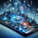
Have you ever wondered why certain app icons on your iPhone just seem to scream your name? Could it be that these little squares of digital design are crafted to cunningly catch your eye and effortlessly lure your fingers towards them like a siren's song? Well, you're not alone! Recent revelations from psychologists suggest that apps—from WhatsApp to Instagram to Spotify—are deliberately designed to capture our attention like a moth to a flame. And let's face it, who can resist a well-designed icon?
First, we need to give a hearty shout-out to the original content creators. Check out the full story at Daily Mail to dive deeper into the psychology behind these app icons.
The Secret Psychology of App Icon Design
App designers employ a variety of subliminal techniques to ensure we're hooked, line, and sinker. They play with color, shape, and even the tiniest details to make these icons not just eye-catching but downright irresistible. But what exactly goes on behind the scenes? Let's take a moment to peel back the glossy veneer of these icons and explore the juicy psychology that drives us to tap-tap-tap away on our screens.
Colors That Speak Louder Than Words
Colors are powerful tools. They evoke emotions and can influence our decision-making without us even realizing it. Take your favorite app's vibrant icon, for instance. Its vivid red, blue, or green isn't just a random choice—it’s a calculated decision to evoke a specific feeling or action. For example, red is often associated with urgency and action, while blue conveys trust and dependability.

Shapes That Tug at Our Subconscious
Let's talk shapes. Our good pal, the humble circle, often represents unity and wholeness—for instance, Snapchat's iconic ghost encircled. Squares might convey strength and stability, or perhaps even trustworthiness. App developers wield these geometric shapes like artists with brushes, painting on the canvas of your home screen.
The Subtlest of Details: You'd Be Surprised!
Ever noticed the use of shine and shadow effects on an iPhone icon? These nuances can create depth, making an icon look 'clickable.' It's as though it's winking at you, "Touch me, I'm approachable."
The Cultural and Social Relevance of App Icons
Now let's zoom out and see this trend's impact. In today's digital age, apps are the gateways to everything—social interactions, businesses, entertainment, and information. App icons not only shape our app choice but also reflect our culture. They become symbols of our tech-savvy generation, subtly shifting and reflecting our societal values.
Breaking Away from Conventional Thinking
Here’s the kicker: We use apps every day, yet rarely scrutinize how and why we're drawn to them. It's a call to action for all of us. Let's rethink how we choose to engage with these digital symbols. Are these icons shaping us just as much as we're shaping the technologies we use?
Beyond the Icons: A Thought Experiment
Imagine for a moment a world where icons don't exist. What would fill that void of visual cues? Text labels alone might prove cumbersome, slowing us down in an age that values speed and efficiency. Perhaps, we're on a constant quest for faster and more instinctive ways to communicate, and these icons, by design, answer our primal craving for quick recognition and ease.
Final Thoughts and Call to Community
All things considered, app icons serve as a testament to the synergy between psychology and design. It's a beautifully mysterious dance that keeps our fingers engaged day in and day out. After all, in a world where time is money, why not fall for an icon that gets straight to the point?
Now, what about you? What colors, shapes, or details draw you to your favorite apps? Are you ready to join the ever-growing community of tech enthusiasts who find wonder in the smallest details? Become part of the iNthacity community, and let's decode the digital world together. If you're on this journey to uncover the "Shining City on the Web", consider this your personal invitation. Share your thoughts in the comments below, and let's spark a conversation.
Like, share, and become an active contributor. Let's explore what lies beneath the surface of those alluring little icons and redefine our relationship with these digital doorways. iNthacity awaits!
Disclaimer: This article may contain affiliate links. If you click on these links and make a purchase, we may receive a commission at no additional cost to you. Our recommendations and reviews are always independent and objective, aiming to provide you with the best information and resources.
Get Exclusive Stories, Photos, Art & Offers - Subscribe Today!
Related posts:
 YouTube reveals truth about viral claims Luigi Mangione posted video saying new details will come ‘TODAY’
 Apple’s $46 Billion Breakthrough: How AI Boosted iPhone Sales This Summer
 Top Plastic Surgeon Reveals the Most Requested Face in 2024
 Secret Pentagon study suggests reincarnation is real after finding consciousness ‘never dies’
 Map reveals safest US states during a nuclear attack


1 comment